Alternative text
What is alternative text?
After using create_template() to create a skeleton of your document, you will see chunks containing fig-alt: in the figures.qmd files, like this:
```{r}
#| eval: false
#| fig-alt: '...'
```
The fig-alt parameter in this chunk signifies that this is where you should add a description of your figure that can be read aloud by the screen reader. This description, otherwise known as alternative text should answer this essential question:
What is this image conveying?
Which information belongs in alt text?
While tempting, tools like AI cannot be used to easily answer this question. Additionally, one should not use the caption as the alt text. Here are four essential ingredients for well-written alt text, as described by Drs. Silvia Canelón and Liz Hare in their talk, “Revealing Room for Improvement in Accessibility within a Social Media Data Visualization Learning Community”:
- Type of data visualization (e.g., scatterplot, line graph, box-and-whisker plot)
- Axis variables
- Range of the data
- The relationship between the variables shown (i.e., what the figure is conveying)
Dr. Hare stresses the importance of ingredient #4 by explaining, “Don’t waste my time with 1-3 if you aren’t going to include 4. While some automatic alt text processes mine some of this information, I don’t want to spend time building a mental model of the graph if I can’t find out what the graph says.”
Both presentations are great resources for learning about alt text and will help you as you craft your own alt text!
Remember: The first three essential ingredients should already be present in your figures’ prewritten alt texts! You just need to check them for accuracy and provide ingredient #4.
Example of alt text
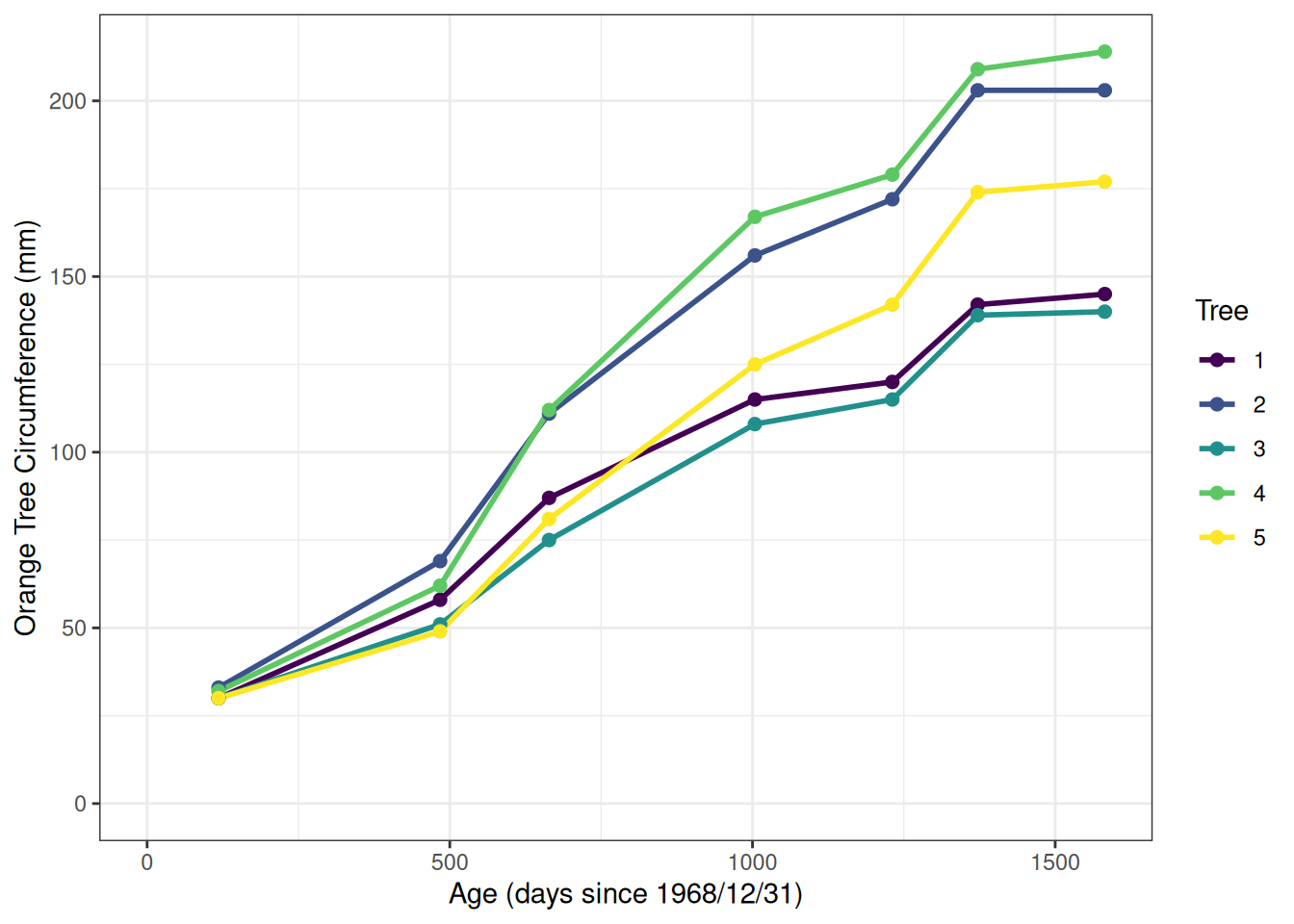
Here is an example of a figure with a caption and alt text. The caption is shown directly below the figure and is written in the chunk’s options (fig.cap=""). The alt text is also included in the chunk’s options (fig.alt="") but is not shown unless the webpage is inspected with Developer Tools or it’s extracted with a screen reader.
library(ggplot2)

orange <- as.data.frame(Orange)
orange <- orange |>
  dplyr::mutate(Tree = base::factor(Tree,
    levels = c(1, 2, 3, 4, 5)
  )) |>
  dplyr::rename(
    Age = age,
    Circumference = circumference
  )

ggplot2::ggplot(
  data = orange,
  aes(
    x = Age,
    y = Circumference,
    color = Tree
  )
) +
  ggplot2::geom_line(size = 1) +
  ggplot2::geom_point(size = 2) +
  ggplot2::scale_color_viridis_d() +
  ggplot2::xlim(0, NA) +
  ggplot2::ylim(0, NA) +
  ggplot2::theme_bw() +
  labs(
    x = "Age (days since 1968/12/31)",
    y = "Orange Tree Circumference (mm)"
  )
The figure’s alt text is written as such:
A line graph showing how tree circumference increases with age for a set of 5 orange trees. Age, shown on the x axis, is measured in days since 1968/12/31 and spans from 118-1582 days. Circumference, shown on the y axis, spans from 30-214 mm. All trees showed an increasing trend of trunk circumference with age, with each tree starting with a circumference of 30-33 mm at age 0 and ending with a circumference of 140-216 mm at age 1582. At age 1582, the tree with the largest circumference was tree 4, followed by trees 2, 5, 1, and 3.
How to write ingredient #4
Ingredient #4 = the relationship between the variables shown (i.e., what the figure is conveying).
There is no one-size-fits-all approach for explaining what a figure is conveying. We’ve included some prompts, below, to get you started, but you will need to go beyond these prompts to properly complete this task.
- Describe the span of the 95% confidence interval at a meaningful x axis value.
- Describe the meaning of the legend.
Line graphs
- Describe where the line increases and decreases.
- Describe where the line dips below the reference point (if present).
Kobe plots
- Describe where most points fall (in the four quadrants).
How to edit your report’s alt text and captions
To edit your rda’s alt text, follow these steps:
- Open your report’s 09_figures.qmd file.
- Run the first code chunk, which saves the filepath of your rda directory as an object (it has the label
"set-rda-dir-figs").
- Find the two code chunks associated with the figure you’re interested (e.g., recruitment). Run the first chunk, which will have “setup” in the label (e.g.,
"fig-recruitment-setup","fig-spawning_biomass-setup", etc.).
-
Add to the alt text by pasting the existing alt text with a new string within the chunk. To do this, find your existing alt text object, which is an object named with the figure’s topic and “alt_text” (e.g.,
recruitment_alt_text). Then, make an object (a string) containing your additional text (e.g., new_alt_text). Then, paste together the existing alt text object and your new text object. For example:
# the original alt text for the recruitment figure
recruitment_alt_text

# the new text that will be added on to the recruitment figure's alt text
new_alt_text <- "This is my new alt text."

# add the new text to the old text
recruitment_alt_text <- paste0(recruitment_alt_text, new_alt_text)
-
Replace the alt text by updating the original alt text object within the chunk. To do this, reassign the original alt text object as your new text object. For example:
# the original alt text for the recruitment figure
recruitment_alt_text

# the new text that will replace the recruitment figure's alt text
new_alt_text <- "This is my new alt text."

# replace the old alt text with the new alt text
recruitment_alt_text <- new_alt_text
NOTES:
Changes to your alt text will be saved within your 09_figures.qmd file, but not within the rda file itself. To directly edit the rda file’s alt text or caption, assign a new value to the text you wish to change. For example, if your rda is called rda and you want to change the caption to “my new caption”, you’d enter the following command: rda[["caption"]] <- "my new caption". To change the alt text, you’d change “caption” to “alt_text” (e.g., rda[["alt_text"]] <- "my new alt text".). Save the changes to the rda’s file by entering the following command (in this example, our rda is called “biomass_figure.rda”): save(rda, file = 'biomass_figure.rda').
Edit figure and table captions with the same process. Just substitute mentions of alt text with caption.
As stated earlier, if you see text that looks like a placeholder (e.g., “The x axis, showing the year, spans from B.start.year to B.end.year…”), that means that there was at least one instance where our tool failed to extract a specific value from the model results and substitute it into the placeholder. Please make sure that your alt text and captions contain the expected values before moving forward with your report. Check out the inst/resources/captions_alt_text_template.csv file in the stockplotr package to view the template with placeholders.
If you add a special character (e.g., percentage sign (%) or dollar sign ($); see full list on this wiki page), please add two backslashes before the character to avoid issues compiling your report later on (specifically, the conversion from Quarto to LaTeX via Pandoc, and then compilation of the LaTeX report after running add_accessibility() or add_alttext()). For example, “The 95% CI” would be written as “The 95\\% CI”.
Acronyms and Glossary
When you use an acronym, it will be included in a glossary that is automatically added to the start of your report. Below are directions for using acronyms and editing the glossary.
Location: The glossary (“report_glossary.tex”) is located in your report folder.
Order: The glossary is sorted alphabetically. Case can differentiate entries (e.g., “M” (natural mortality) is different from “m” (meter(s)).)
Structure: Each acronym has its own line, structured like this:
\newacronym{<"label" or "key">}{<"short form" or "acronym">}{<"long form">}
“label” (or “key”): The term written in the report body. The label links the short form (see below) to the glossary entry. In our glossary, labels are typically lowercase. Examples: bcurrent, noaa.
“short form” (or “acronym”): The term actually shown when the report is rendered. The short form may have formatting applied to it. Examples: $B_{current}$ (which will render as ), NOAA.
“long form”: The meaning of the short form. Examples: current biomass of stock, National Oceanic and Atmospheric Administration.
Here are two entries using the examples mentioned above:
\newacronym{bcurrent}{$B_{current}$}{current biomass of stock}
\newacronym{noaa}{NOAA}{National Oceanic and Atmospheric Administration}
NOTE: There are some entries with the same acronym, but with different labels and meanings. For example:
- the ‘GOA’ acronym appears twice: for the Gulf of Alaska (label: ‘goa-ak’) and America (label: ‘goa-se’).
- the ‘CA’ acronym appears twice: for California (label: ‘ca-cali’) and Canada (label: ‘ca-canada’).
Each pair of acronyms is included with the assumption that both will not appear in the same report. If both pairs appear in the same report, the report will not render. If you need to use both, please edit your individual report_glossary.tex file and change the ‘Acronym’ for one entry to differentiate the pair. For example, you could change the ‘ca-canada’ acronym from ‘CA’ to ‘CAN’.
Survey names
Many people refer to surveys with nicknames or “informal” names that do not match up with administrative documentation. For example, the “Atlantic Surf Clam & Ocean Quahog Dredge” is sometimes called the “clam survey”. To facilitate communication in the reporting process, we have added survey names to the glossary.
Informal survey names (i.e., nicknames used to refer to surveys that are not correct) are listed in the “Acronym” column.
Formal survey names (i.e., the correct survey names) are listed in the “Meaning” column.
NOTE: To increase findability, surveys may have multiple entries to link informal with formal names. Specifically, there may be more than one ‘label’ (first curly braces entry) or ‘acronym’ (second curly braces entry) with the same ‘long form’ (third curly braces entry). If the first ‘label’ you find for a given survey seems too long, look for an alternative entry with the same ‘long form’ but a different ‘label’ and/or ‘acronym’.
For example, there are three entries for the ‘long form’ ‘Northeast Ecosystem Monitoring (EcoMon)_Fall’:
\newacronym{ecomon fall}{ECOMON Fall}{Northeast Ecosystem Monitoring (EcoMon)_Fall}
\newacronym{fall nefsc ecosystem monitoring survey}{Fall Northeast Fisheries Science Center Ecosystem Monitoring Survey}{Northeast Ecosystem Monitoring (EcoMon)_Fall}
\newacronym{nemef}{NEMEF}{Northeast Ecosystem Monitoring (EcoMon)_Fall}
If you would like us to add more survey name pairs to our table, please make an issue or, even better, submit a pull request. Please see the GitHub Docs’ “Contributing to a project” page for step-by-step guidance in making a pull request. Thank you!
Editing the glossary
Remember that your changes will only be reflected in your report folder’s glossary .tex file, not in the file stored in the asar package’s inst/ folder. If you regenerate your report folder, that main file will overwrite your edited version unless you have indicated otherwise.
If you would like to contribute suggestions to the glossary, please open a pull request or issue.
How to remove a glossary entry
Delete the entire line in the file.
How to add a glossary entry
First, ensure that your new acronym is not already duplicated in the glossary as this will cause an error upon rendering.
Find the logical location for your acronym based on alphabetical order. Make a new line and add the appropriate information for your acronym and its meaning, based on the structure discussed above.
How to edit a glossary entry
You can edit any entry as needed.
How to indicate that a word is an acronym
First, check if the glossary contains your acronym; if it doesn’t, you can edit the file and add it yourself (see section above).
Once your acronym is in the glossary, go back to the location of the acronym in your report. Encase it in curly brackets ({}), with “\gls” preceding it. For example, to indicate “ABC” is an acronym, you would write \gls{ABC}. Use this notation each time you use the acronym in your text.
Good news: when using this notation, you never have to spell out the full meaning of the acronym upon its first usage, or even remember the location of its first usage! The CTAN glossaries package takes care of all of that.
Your text will look like this:
This is the first instance of \gls{ABC}. Here, \gls{ABC} is used a second time.
And it will render like this:
This is the first instance of Acceptable Biological Catch (ABC). Here, ABC is used a second time.
For specialized commands that enable capitalization, reference to acronyms’ meanings, and more, check out the Command Summary (pg 46) within the glossaries package’s beginners’ guide.