Figures for Methods Section
TMB-validation-figures-methods.RmdFigure 1
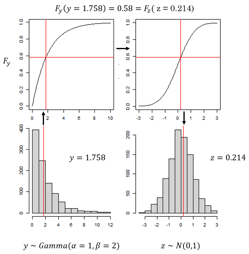
Figure 2
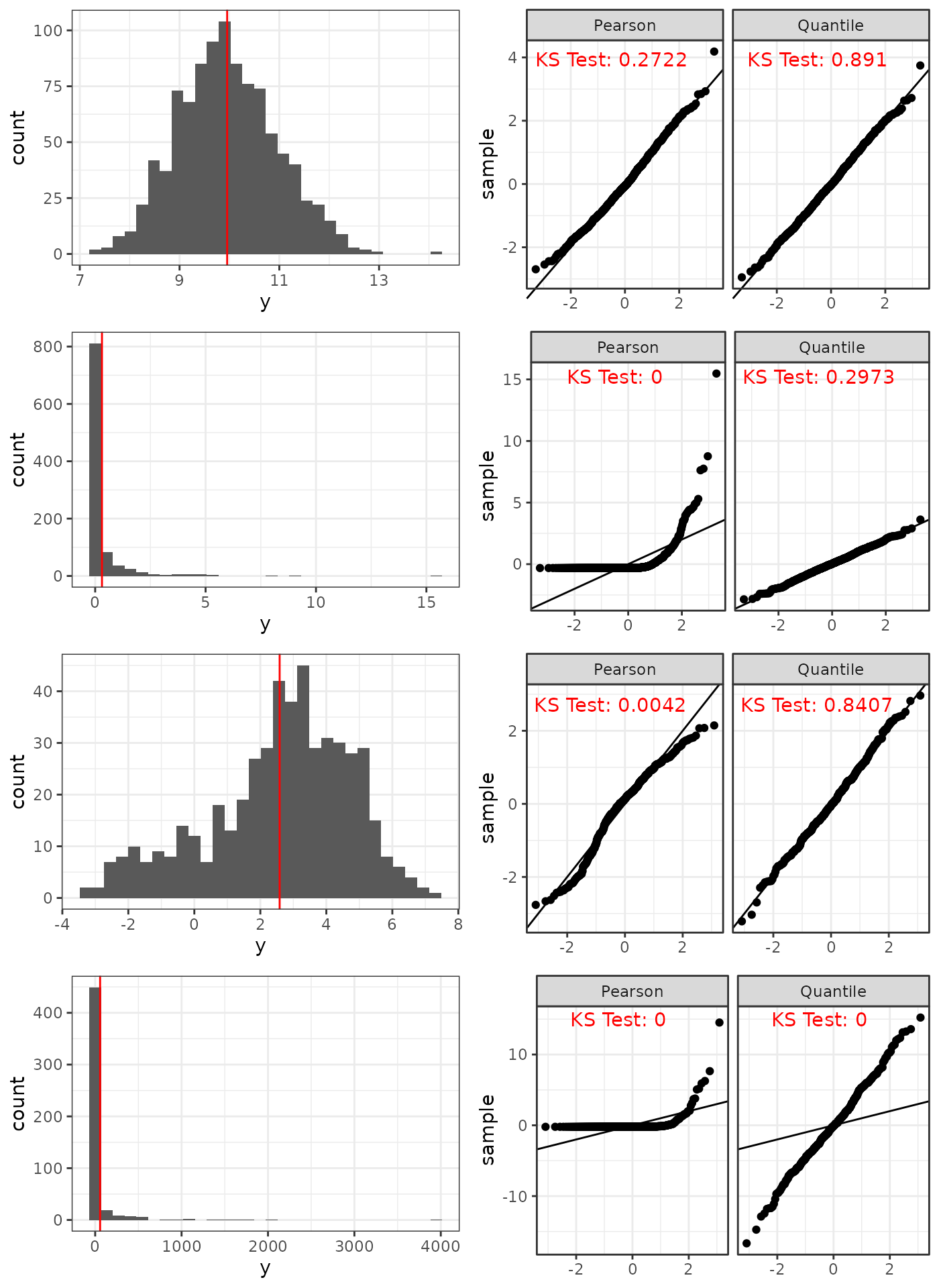
Pearson versus Quantile residuals for the correct model under four different scenarios (top to bottom): Approximately Normal Gamma, Skewed Gamma, Correlated Normal with rotated residuals, and Gamma with rotated residuals.
Figure 3
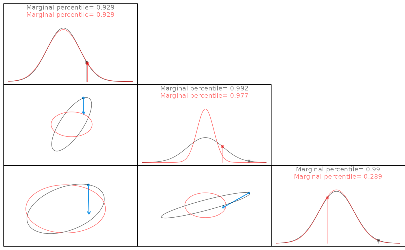
Multivariate normal data from a 3x3 corvariance matrix. Off-diagonal plots display correlation structure between each data column prior to (grey) and after (red) the decorrelation transformation. The blue arrow tracks points during the decorrelation step. All points move toward the center, indicating a scaling step. Not all points retain the same marginal percentage nor do they all end on the red sphere, demonstrating that a rotation is being applied in addition to the scaling.
Figure 4
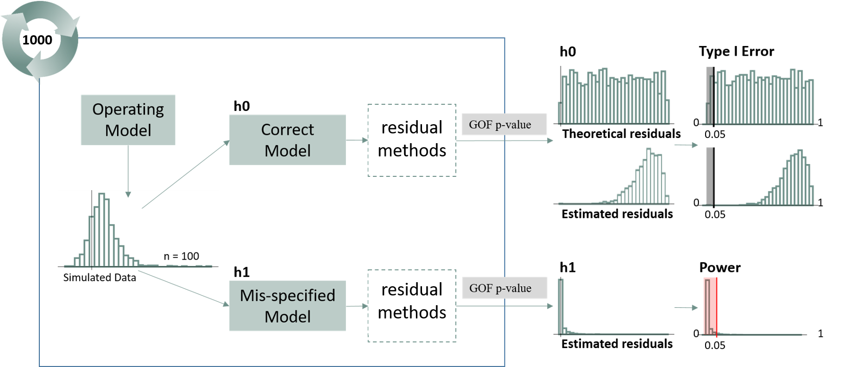
Overview of Simulation Study. Data were first simulated under the Operating (Correct Model). Data were then fit to two separate models: the same operating model and the mis-specified model. For each model fit, quantile residuals and subsequent goodness-of-fit (GOF) p-values were calculated for each method using both a Kolmogorov-Smirnov (KS) and Anderson-Darling (AD) normality test. This simulation was repeated 500 times and resulted in a distribution of p-values for each method under the correct and mis-specified model. Type I error was calculated as the proportion of correctly specified simulations that resulted in a p-value of less than 0.05. Power was calculated as the proportion of mis-specified simulations that resulted in a p-value of less than 0.05. Correctly specified models should result in a p-value less than 0.05 5% of the time while mis-specified models should result in a p-value less than 0.05 95% of the time.
Extra Plots
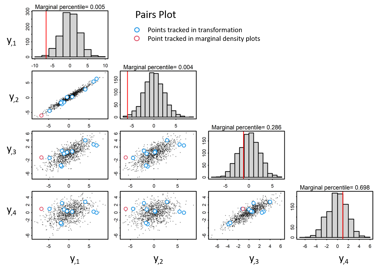
Given zero-centered multivariate data with a covariance matrix, Sigma. Pairs plots visualize the correlation structure of the data. Blue and red indicate points tracked in transformation. The red points correspond with the marginal percentile in the histogram.
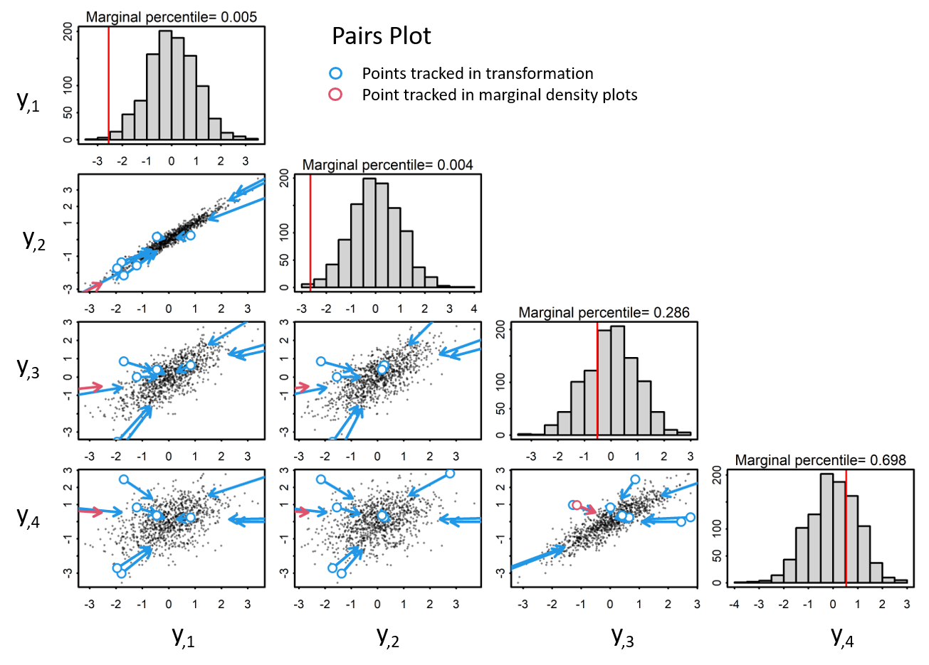
When observations are scaled to a unit variance, data are transformed to standardized normal space, yet correlation structure is retained.
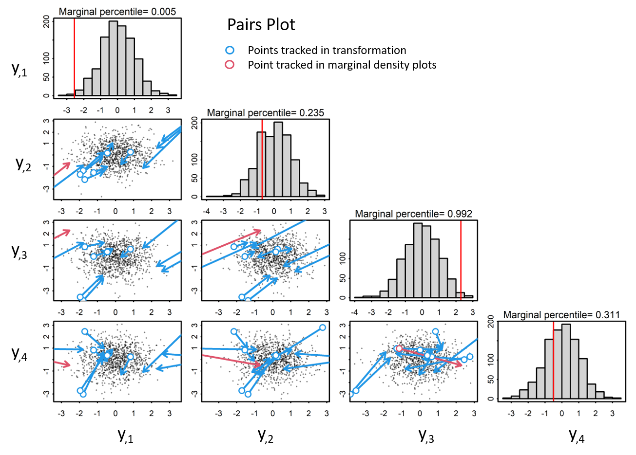
In order to properly decorrelate the data, we need to apply a decoorelation method, such as the cholesky transformation. In this approach, we calculate the cholesky decomposition of the covariance matrix, Sigma, with which we use to transform the data to iid standardized normal space via both a scaling and a rotaion.